***** ALERT - Nominations for your new ClubCJ Committee can be made here *****
Photoshop Heads !
Moderators: Moderators, Senior Moderators
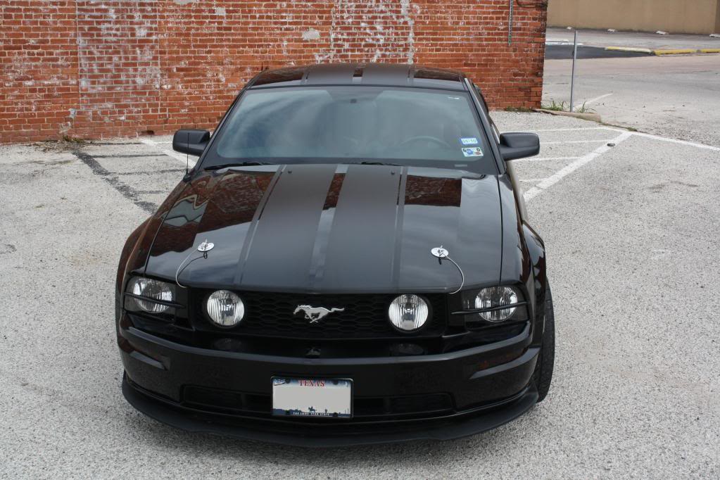
Ya all matte black cars are nice and even nicer if any trim/decal/strips are then gloss black. Real subtle until the light hits it right and you see the decal or stripe etc.
Gloss black car with matte black strips would look neat.
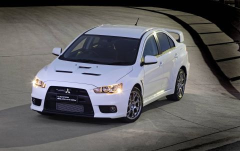
I wonder how gloss white/matte white would look? I had some spare white cf vinyl from my stereo install I was maybe gonna wrap the bonnet in but next to the wicked white its more of a cream/beige

Gloss black car with matte black strips would look neat.
I wonder how gloss white/matte white would look? I had some spare white cf vinyl from my stereo install I was maybe gonna wrap the bonnet in but next to the wicked white its more of a cream/beige

- Latino_Ralliart
- Lancer VRX/GTS

- Posts: 337
- Joined: Sat Feb 26, 2011 9:07 pm
- Location: Sydney
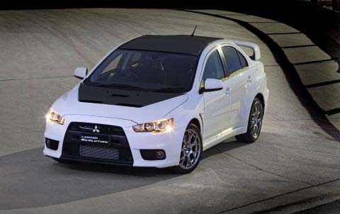
Hey glenn that bonnet does look good how it cuts short and doesnt go write to edge, deffs go for it
as to what i suggested from the start, who knows what i was thinking haha in my head it didnt look bad, on paper absolutely horrible does look like a povo repair job...
will go ahead with the matte black stripe or design will keep you guys posted when it goes ahead (Probably a few months away now)
as to what i suggested from the start, who knows what i was thinking haha in my head it didnt look bad, on paper absolutely horrible does look like a povo repair job...
will go ahead with the matte black stripe or design will keep you guys posted when it goes ahead (Probably a few months away now)
- craigeth
- Lancer VR/GT

- Posts: 249
- Joined: Thu May 19, 2011 11:25 am
- Location: Cairns, Australia
- Contact:
Mattigins wrote:[img:f4ed1e9931]http://www.clubcj.net/img/images/1325731290_b_wiffler.jpg[/img:f4ed1e9931]
Good old collingwood forever! :p
Twenty Three Frames - Photography and Video Production
www.twentythreeframes.com
www.twentythreeframes.com
- Tarquin
- Lancer Legend

- Posts: 1015
- Joined: Wed Sep 03, 2008 8:54 am
- Location: BrisVegas, QLD, Australia
@ Brendan - I wouldn't go white bonnet and/or roof - but maybe a the Carbon or a texture....?
I'm going to get the Metallic Grey that matches the front grill surround plastics for the front grill and lower section, and probably use same colour for accents - thought about maybe the roof too
Matte black stripes would be cool. Thought about them a few times.
I prefer the pictured design - or a single set of those offset to one side a bit more (like the Bathurst release on the Bommadoor)
White GT stripe example from an older member not too regular here any more - Big Dave's CJ Thread
@Glenno - Do It !!!! The white/black combo is cool....
This is sweet.....
Wraptivo Lancer Evo X
And this Video - Just 'cause its wiked !! lol
2010 Korea RC Street Drift Challenge
hah thats the same video I saw a while back and thought one day. goes by the name of WILFAST Evo X I think. Even has an RC car modelled after his car.
Should have some pics to post by the end of the month if all goes to plan!!!
Ya the 2 plain solid strips should be left to the muscle cars in my opinion. having that thin stripe next to them or offset a bit would be more original. Cant find a picture of it but having the end of the stripe go from solid to nothing by fading out from big squares to little ones. looks cool in my mind at least haha
Who is online
Users browsing this forum: No registered users and 40 guests


